- UX for AI
- Posts
- Storyboarding for AI-driven Products - Part 4: What sets the storyboards for AI-driven products apart?
Storyboarding for AI-driven Products - Part 4: What sets the storyboards for AI-driven products apart?
In Part 4 we bring everything together and wrap it with a pretty bow and a final example, showing the importance of focus on the “what” and “why" and omitting as much of the interface as possible.
Greg Nudelman
August 16, 2024
In the UX Storyboarding for AI series:
What sets the storyboard for AI-driven products apart?
Specialized Subject-to-AI transitions.
Strong focus on the “what” and “why.”
Omitting as much of the interface as possible.
The simple reason for a more abstract presentation is that AI is now actively permeating a variety of our common everyday objects, so there may be multiple different solutions available to a given problem — or even a solution that involves a combination of gadgets, devices, and agents.
For AI-driven use case storyboards, being brief and ommitting any extra panels or anything that might limit the team’s imagination is important. Use abstract representations whenever possible, but also make sure that your story hangs together well. It’s a balance.
Let me give you a simple AI-driven product case study: Answer Phone While Driving. First, let’s review how a typical experience might look today, based on the design of the Apple Watch answer phone call feature:

Answering the phone using Apple Watch. Image Source: Apple.com
And here’s the storyboard:
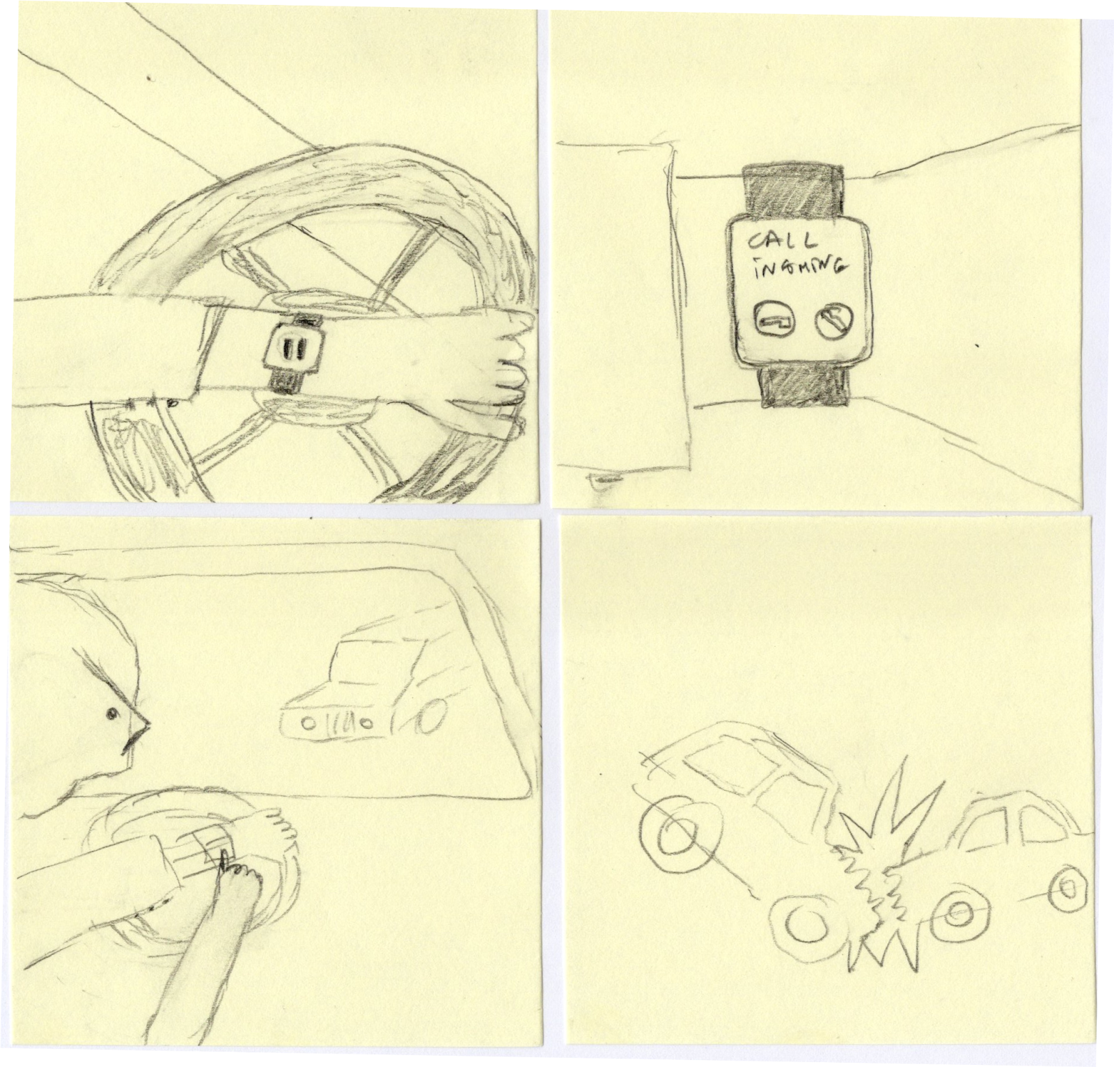
Answer Phone While Driving, Present State. Image Source: Greg Nudelman
In this “current experience” storyboard:
The protagonist is driving his car and listening to music (maybe even “The Final Countdown”? That’s a fine song. And so apropos!)
Suddenly, a phone call comes in on his watch, indicated by those two tiny buttons.
Naturally, to hit one of these tiny buttons, he has to take his eyes off the road and look at his watch.
Which leads to a disaster.
Instead, let us reimagine how this experience might look if Tony Stark (Iron Man) were to design it:
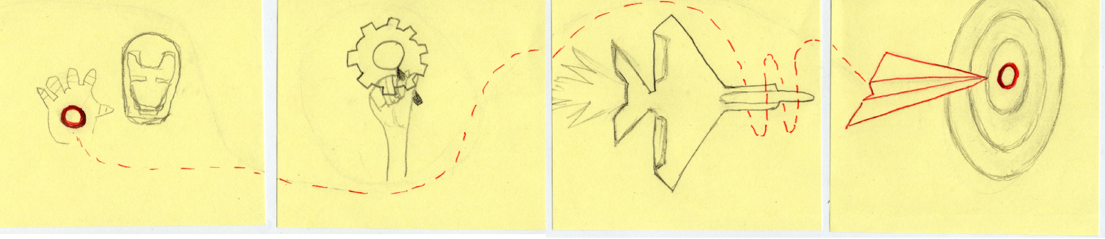
Design like Tony! Image Source: Greg Nudelman
In our revised story, our AI-driven wearable would act more like Jarvis, the AI in the Ironman suit, and not like a thoughtless, distracting, expensive toy:
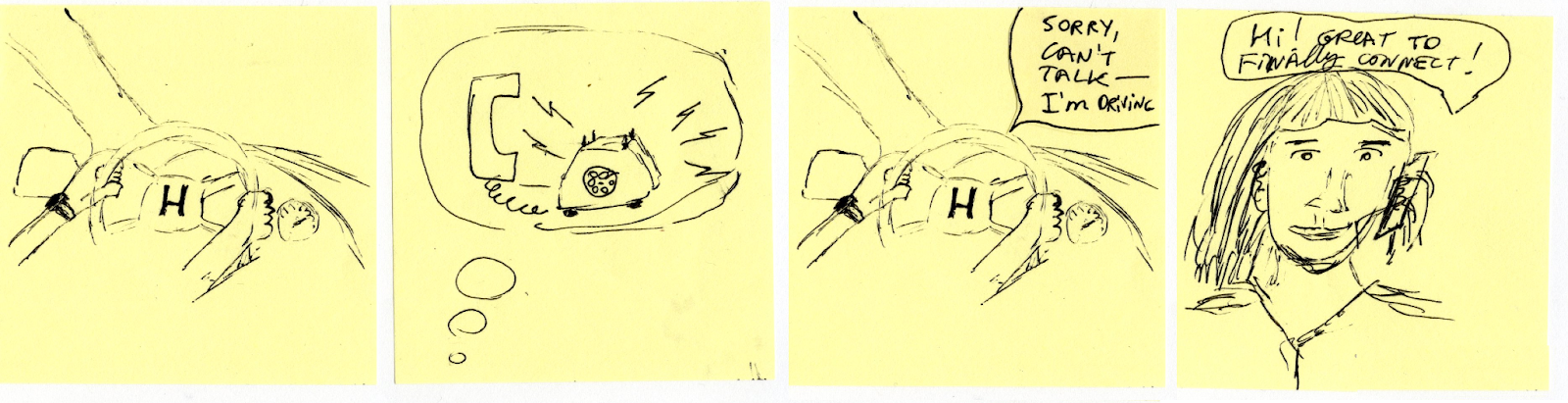
Answer Phone While Driving, Revised State. Image Source: Greg Nudelman
In the new version of the same story:
The protagonist is driving a car with both hands on the wheel (and eyes on the road!)
She receives an incoming phone call (note the abstract representation of that, as we don’t know precisely how an incoming phone call will be indicated to the user, but it should be in some non-distracting way.)
The protagonist responds using natural language: “Sorry I can’t talk – I’m driving… (I’m in traffic; it’s raining! I’ll call you back, etc.)” Note that there are no other prompts or AI invocations – the protagonist is simply talking naturally. Again, hands are firmly on the wheel, eyes on the road.
The conclusion panel shows the protagonist calling the person back after arriving safely at her destination.
The new AI-driven product storyboard is brief. It leaves some things (like how the phone call is communicated) to the reader’s imagination and further research. It also provides a tangible solution to a real problem—distracted driving and Apple’s truly pitiful design decision—using a better UX design and existing AI capabilities such as voice-to-text.
Note that in the revised story, the Conclusion slide is not some grand revelation or a huge glorious accomplishment: it is simply the everyday act of arriving safely to your destination. Despite being “simple,” the Conclusion panel is realistic and works well when juxtaposed with the original storyboard showing a tragic outcome.
Pen or Pencil? Throughout the series, we’ve given you several examples of each. My advice is that unless you are really amazing at drawing, there is not much to be gained by forgoing the eraser. Unless maybe you are alerging to rubber or graphite. Or have a serious masachistic streak. (Then again, I wrote 6 books so who am I to judge others on being suckers for punishment…)
I hope we did a decent job of educating and entertaining. No offense was intended against any animals or robots, living or dead. If you found this series helpful, please take a moment to vote for my UX for AI workshop at the next SXSW: https://panelpicker.sxsw.com/vote/151357
Also, register for our next full-day UX for AI workshop at Boulder, CO, on September 9th to practice drawing storyboards and doing other exercises, such as Digital Twin, which are essential for success on your next AI project: https://strat.events/usa/tickets
Finally, I hope you have fun with your AI-driven product storyboards – it’s one of the few times in your adult life you get paid and add value by pretending you are eight years old all over again! And that is just one of the things that makes UX Design such an awesome profession.
Peace,
Greg
P.S. Our fabulous full-day workshop on September 9th, 2024, at UXStrat in Boulder WILL sell out like our previous workshops at UXStrat 2023, UX Copenhagen, UXLx in Lisbon, and Rosenfeld Media workshop online. If you found this article helpful, don’t delay and miss out on critical learnings you will need in your next project. Get your ticket now: https://strat.events/usa/tickets
P.P.S. And please remember to vote for my session at SXSW: https://panelpicker.sxsw.com/vote/151357
Reply